3.3 KiB
3.3 KiB
Data Visualization for Public Policy
Recap: Why Do We Create Visualizations?
- To better understand large, complex datasets.
- To influence others through compelling, evidence-based storytelling.
Influence: The Power of Visual Communication
Effective data visualizations can:
- Draw attention to critical problems or potential solutions.
- Argue for specific policy interventions.
- Connect an audience with large and potentially abstract data concepts.
Key Ideas Exercise
What are your golden rules of data visualization?
(Some) Key Rules for Effective Data Visualization
1. Audience-Centered Design
- Take time to consider and understand your audience's background, expertise, and information needs.
- The "best" data visualization is one that the audience understands & remembers.
2. Prioritize Truthful Representation
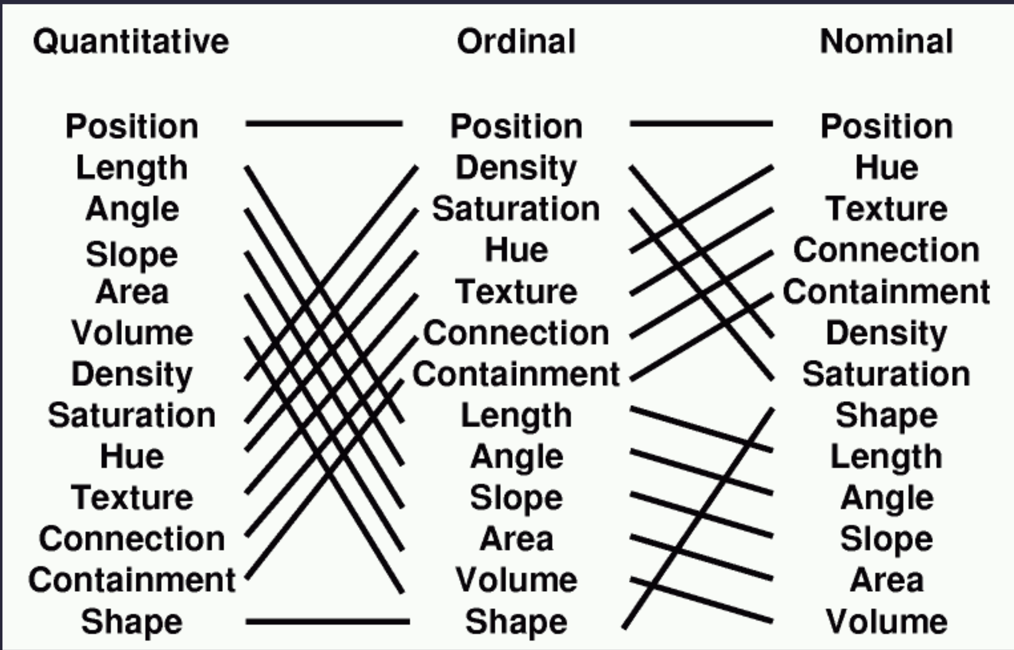
- Correct chart types & encodings.
- Never sacrifice data integrity in the name of a "better" chart.
- Avoid misleading choices: truncated axes, dual axes, etc.
- Consider the role of uncertainity in representing your data.
3. Maximize Clarity and Comprehension
- Simplify complex information where possible. It is OK to refer a user to a table or other source for deeper analysis.
- Remove unnecessary visual elements -- "chart junk"
- Guide the viewer's attention to key insights with labeling.
Tufte's Key Ideas Revisited
- Graphical Integrity: Above all else, show the data.
- Maximize the data-ink ratio.
- Minimize chart junk.
- Aim for high chart density, consider small multiples.
- Revision & Editing are essential.
4. Optimize for Accessibility
- Use color-blind friendly palettes.
- Ensure readability for viewers with different visual capabilities. (Contrast,font size, etc.)
- Provide alternative text descriptions in web presentations.
<img src="..." alt="A graphic representing the length of rivers..." />
- Accessibility tools: contrast/color/WCAG checkers.
5. Build a Compelling Narrative
- Create a clear, coherent story and use graphics to support it.
- Each chart should have a clear "why" -- don't make users wonder why you're showing them something.
- Use visual elements & conventions to guide the viewer through key arguments and order.
- Connect data to broader context and implications.
6. Embrace Iterative Improvement
- Seek feedback from diverse perspectives, especially those represented in your audience.
- Be willing to revise and refine, if someone had an issue others will too.
7. Consider Ethical Implications
- Represent marginalized groups respectfully: color choices, language.
- Remember that pixels often represent people, dismissing outliers/etc. should not be done without consideration.
- Be transparent about data sources and limitations.
- Use visualization as a tool for understanding and persuasion, not manipulation.
Conclusion
Effective data visualization is both an art and a science.
Understand your data and what you people to understand.
Center your audience.
Prioritize clarity & truth.
Be creative & have fun!


