5 KiB
| theme |
|---|
| custom-theme |
Chart Design
CAPP 30239
Today
- What general principles of visual design are relevant to our work?
- What are the common types of charts and how do we use them?
- When and how do we break the rules?
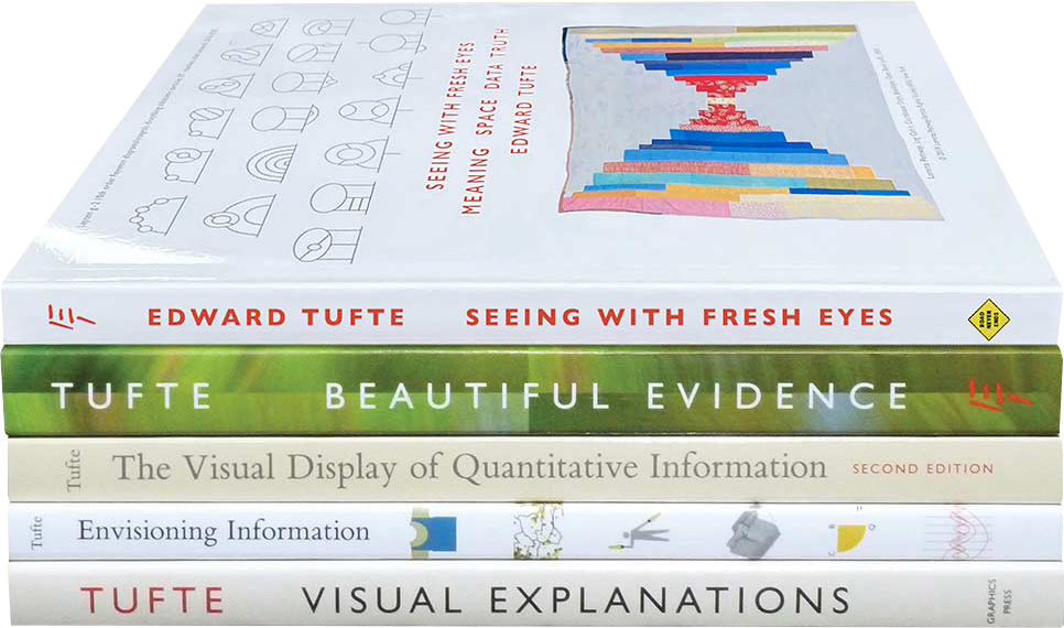
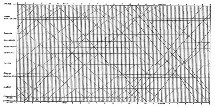
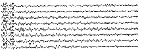
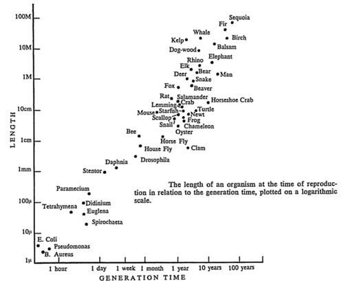
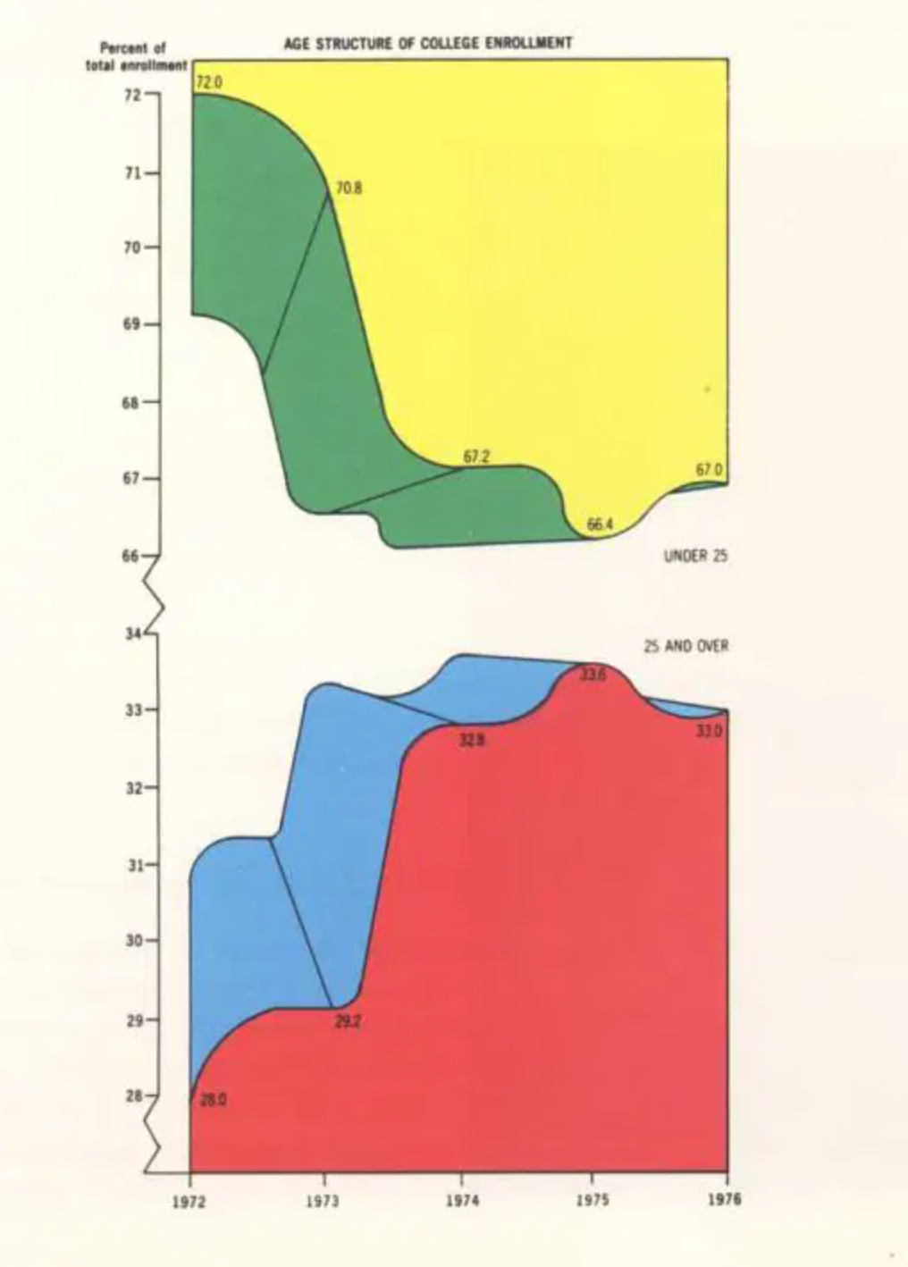
Edward Tufte
The Visual Display of Quantitative Information
Key Ideas
- Graphical Integrity: Above all else, show the data.
- Maximize the data-ink ratio.
- Minimize chart junk.
- Aim for high chart density, consider small multiples.
- Revision & Editing are essential.
Tufte's Principles for Graphical Integrity
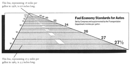
- The representation of numbers, as physically measured on the surface of the graphic itself, should be directly proportional to the numerical quantities represented.
Mileage increase: 53% Graph length increase: 783% "Lie Factor": 14.8x
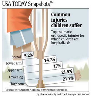
- Clear, detailed and thorough labeling should be used to defeat graphical distortion and ambiguity.
How many children get a spinal injury every year? (out of 74,000,000 children in US)
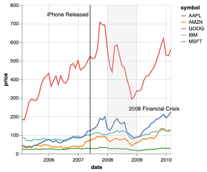
- Write out explanation of the data on the graphic itself. Label important events in the data.
- Show data variation, not design variation.
Deflated & standardized units of money are almost almost superior to nominal units.
The number of information-carrying (variable) dimensions depicted should not exceed the number of dimensions in the data. (roughly 1:1 channel mapping)
Exception: It is OK/common to pair color & shape, or for print color & texture to address issues that color presents.
Data-Ink Ratio
- Data-ink: Ink (pixels) used to show data.
- Data-ink ratio: data-ink / total-ink
Optimizing Data Density
Number of entries in DataFrame / Area of Graphic.
Classic example of high data density is the sparkline, which can fit on a line of text.
Chart Junk
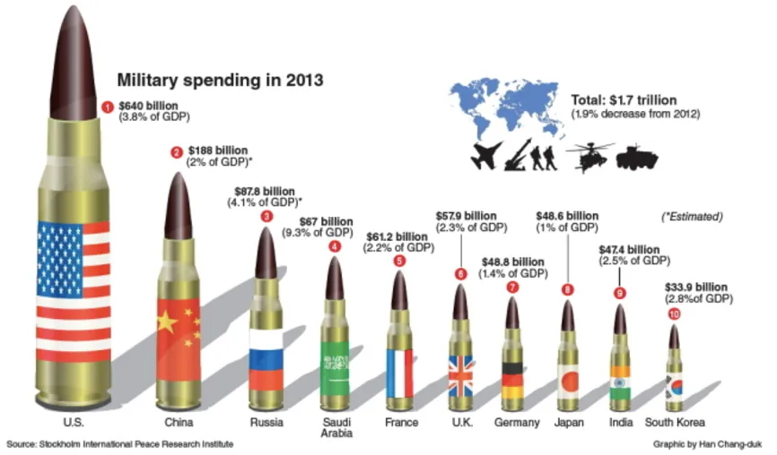
Anything that isn't relevant to understanding the data.
Common Chart Types
Bar Charts & Histograms
- X/Y: Nominal (Binned Numerical - Histogram)
- Y/X: Quantitative
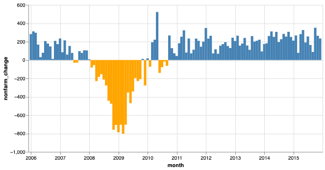
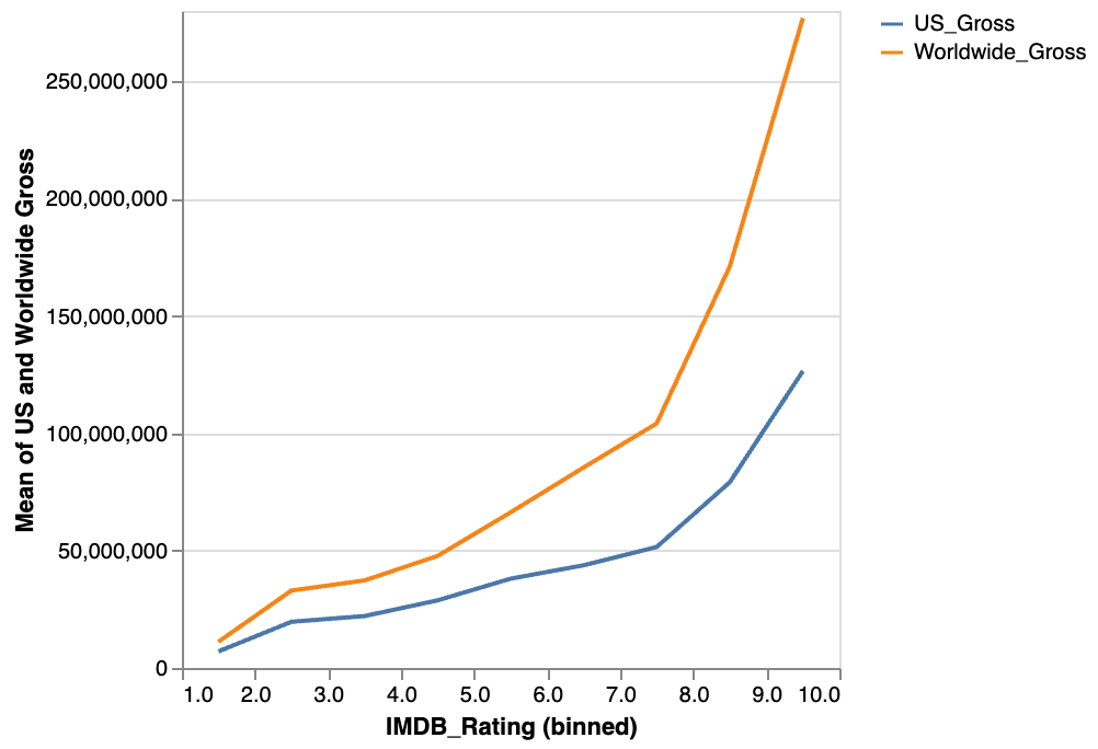
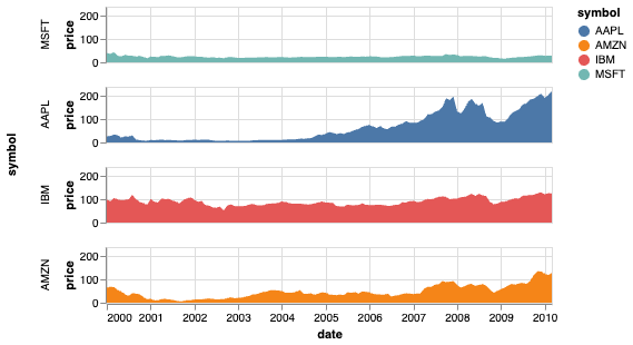
Line & Area Charts
- X: Temporal
- Y: Quantitative
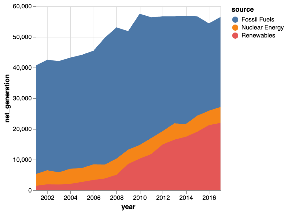
When to use stacked area charts?
Combined X axis variable has meaning.
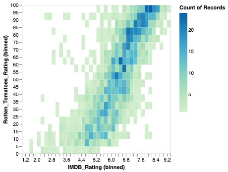
Heatmap
- X & Y: Quantitative or Nominal
- Color: Quantitative
mark_rect
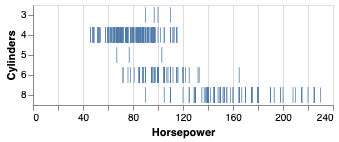
Strip Plot
- Y: Nominal
- X: Temporal or Quantitative
- Color: Optional (any type)
mark_tick
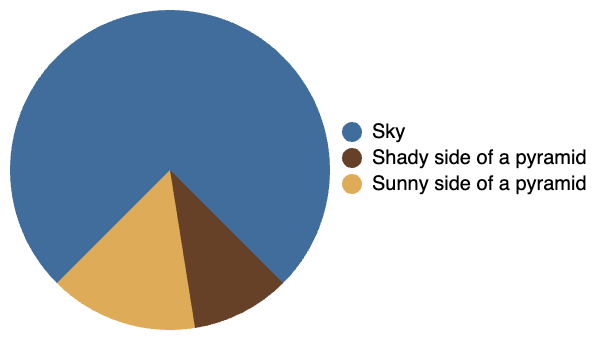
Pie / Donut / Radial Charts
Theta: Quantitative (ratio) Color: Nominal
Direct comparison of segments is very difficult at n > 2.
Only use when most important information is ratio between sizes, and relatively few categories.
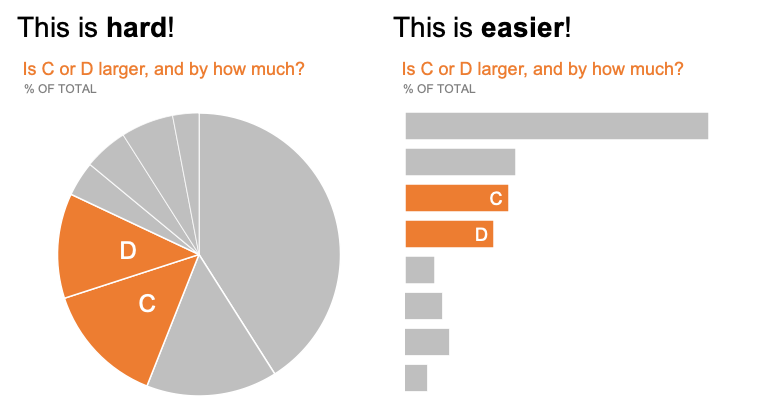 https://www.storytellingwithdata.com/blog/2020/5/14/what-is-a-pie-chart
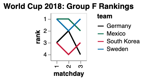
Bump / Rank Line Chart
Useful for showing changes in relative positioning.
Require some data manipulation using transform_window or pre-computing ranks. (see Altair gallery examples.)
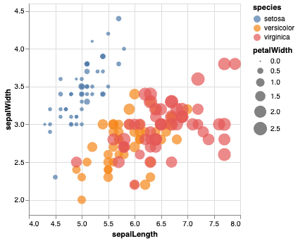
Scatter & Bubble Plots
- X / Y: Quantitative
Bubble charts use size as a 3rd dimension.
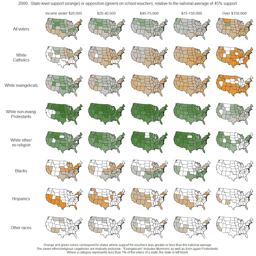
Small Multiples / Faceting
Most useful when there is a nominal variable that charts vary on.
Distributions
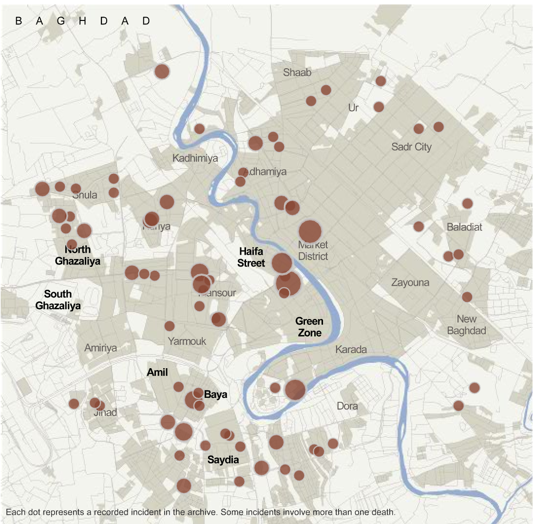
Map Basics
When & How to Break the Rules
When in doubt...
- 95% of visualizations should be some variation of the common types.
- Focus on Tufte's rules for clarity.
Case Study: Two Innovations
Two visualization types that have had their moment in the past 10-15 years:
- Hex/Grid Maps
- Word Clouds
Grid Map
Introduced in https://blog.apps.npr.org/2015/05/11/hex-tile-maps.html
Word Cloud
Derived from same data as word cloud.
source: NYTimes via https://www.niemanlab.org/2011/10/word-clouds-considered-harmful/
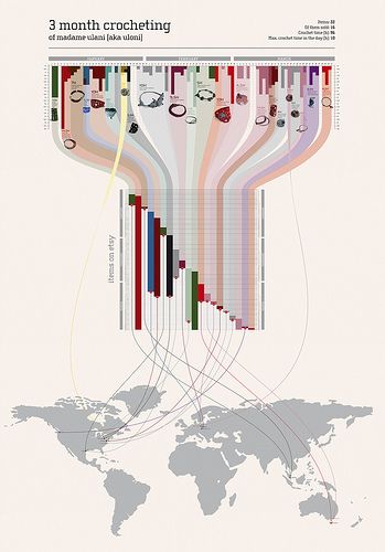
Narrative-supporting graphics
by ulaniulani on flickr
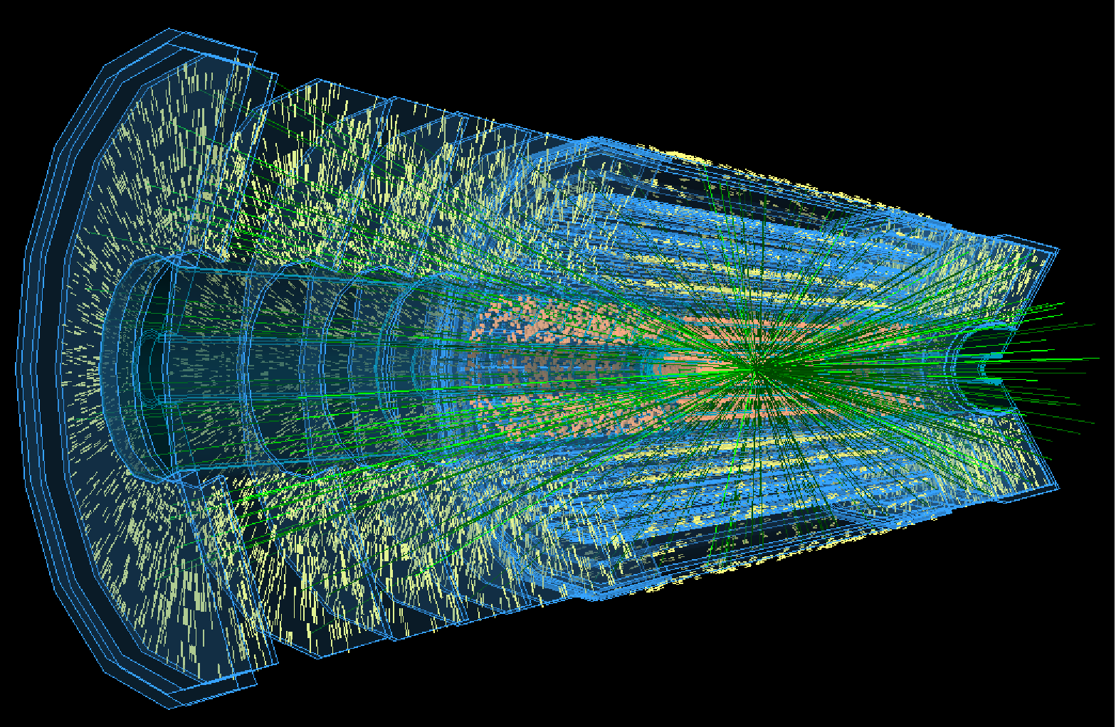
When it's OK to use 3D
You have data that truly makes more sense in 3D.
and/or
You work at CERN.
Acknowledgements & References
Thanks to Alex Hale, Andrew McNutt, and Jessica Hullman for sharing their materials.
- https://www2.cs.uh.edu/~ceick/NO/COSC3337-DV2.pdf
- Images from Tufte's Visual Display of Quantitative Information
- Images from Altair https://altair-viz.github.io/gallery/index.html
