2.8 KiB
| theme |
|---|
| custom-theme |
Chart Design
CAPP 30239
Today
- What general principles of visual design are relevant to our work?
- What are the common types of charts and how do we use them?
- When and how do we break the rules?
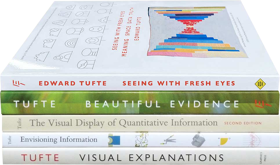
Edward Tufte
The Visual Display of Quantitative Information
Key Ideas
- Graphical Integrity: Above all else, show the data.
- Maximize the data-ink ratio.
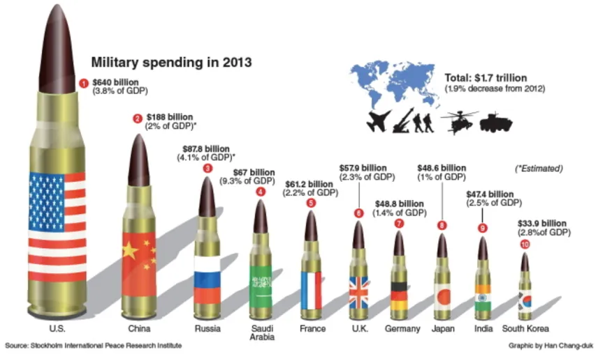
- Minimize chart-junk.
- Aim for high chart density, consider small multiples.
- Revision & Editing are essential.
Tufte's Principles for Graphical Integrity
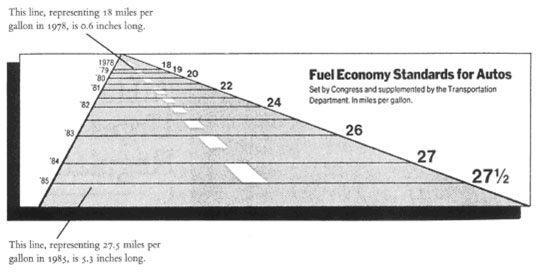
- The representation of numbers, as physically measured on the surface of the graphic itself, should be directly proportional to the numerical quantities represented.
Mileage increase: 53% Graph length increase: 783% "Lie Factor": 14.8x
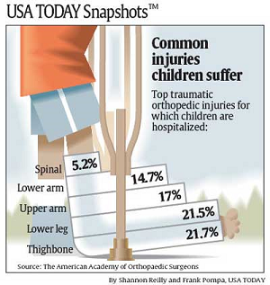
- Clear, detailed and thorough labeling should be used to defeat graphical distortion and ambiguity.
How many children get a spinal injury every year? (out of 74,000,000 children in US)
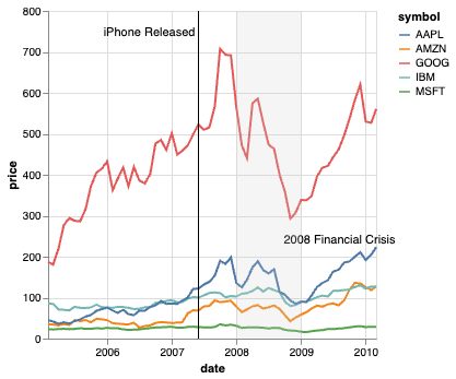
- Write out explanation of the data on the graphic itself. Label important events in the data.
- Show data variation, not design variation.
Deflated & standardized units of money are almost almost superior to nominal units.
The number of information-carrying (variable) dimensions depicted should not exceed the number of dimensions in the data. (roughly 1:1 channel mapping)
Exception: It is OK/common to pair color & shape, or for print color & texture to address issues that color presents.
Data-Ink Ratio
- Data-ink: Ink (pixels) used to show data.
- Data-ink ratio: data-ink / total-ink
Optimizing Data Density
Number of entries in DataFrame / Area of Graphic.
Classic example of high data density is the sparkline, which can fit on a line of text.
Chart Junk
Anything that isn't relevant to understanding the data.
Common Chart Types
Bar Charts & Histograms
Line & Area Charts
Sparklines
Strip Plot & Heatmap
Pie / Donut / Radial Charts
Ranked Line Chart
Scatterplots
Small Multiples / Faceting
Distributions
Map Basics
Altair Gallery Miscellania
When & How to Break the Rules
2 Examples: Hex / Grid maps ... Word Clouds
Narrative-supporting graphics
When it's OK to use 3D
Acknowledgements & References
Thanks to Alex Hale, Andrew McNutt, and Jessica Hullman for sharing their materials.
