9.8 KiB
| theme |
|---|
| custom-theme |
Perception & Color
CAPP 30239
Today
- What matters most when creating a visualization?
- How does human perception factor into visualization design?
- Understanding color, and computational representations of it.
What is the most important question when creating a visualization?
What is the most important question when creating a visualization?
Where will the data come from?What type of chart do I use?- Who is the audience?
Audience First
- Who are you presenting to?
- How familiar are they with the data?
- What is their numerical & visualization literacy?
- Via what medium will they receive the information?
- What are you trying to do? (Persuade, Inform, Inspire?)
Only now can we start thinking about data and presentation.
Perception
- Selective - We can only pay attention to so much.
- Patterns - Our brains are pattern-matching machines, audience will benefit from intentional patterns & be distracted by unintentional ones.
- Limited working memory - We hold a very limited set of information in our minds at once.
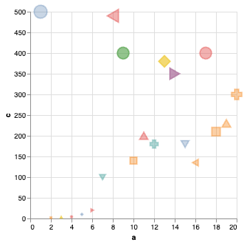
What do you see?
alt.Chart(random_df).mark_point().encode(
    alt.X("a"),
    alt.Y("c"),
    alt.Color("b"),
    alt.Size("c"),
    alt.Shape("a:N"),
    alt.Fill("b"),
    alt.Opacity("b"),
)
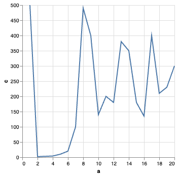
What do you see?
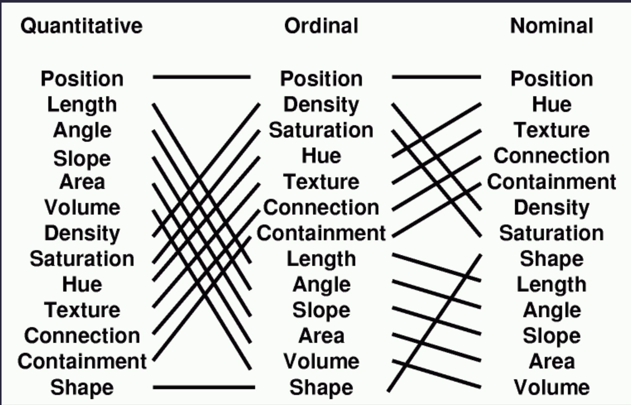
Effectiveness Revisited
Altair Channels
- Position (
X, Y) - Angle (
Angle) - Area (
Radius,Size) - Hue, Saturation (
Color) - Texture (
Opacity,Fill) - Shape (mark type,
Shape)
What about?
- Length
- Slope
- Volume
- Density
- Connection
- Containment
Derived Properties
- Length/Area - size of bars (
X,Y) - Slope & Density - affected by scale
- Connection - ex. layering of lines w/ points
- Containment - achieved with layering
What about volume?
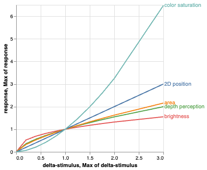
Stevens' Power Law
Stevens (1975): Human response to sensory stimulus is characterized by a power law with different exponents with different stimuli.
perception = (magnitude of sensation)a
Smaller a exponent: harder to perceive changes.
Stevens measured values of a by exposing people to varied stimulus and asking them to compare magnitudes.
| Continuum | Exponent |
|---|---|
| Color Brightness | 0.33-0.5 |
| Smell | 0.6 |
| Loudness | 0.67 |
| Depth Perception | 0.67 |
| Area | 0.7 |
| 2D Planar Position | 1.0 |
| Warmth | 1.3-1.6 |
| Color Saturation | 1.7 |
| Electric Shock | 3.5 |
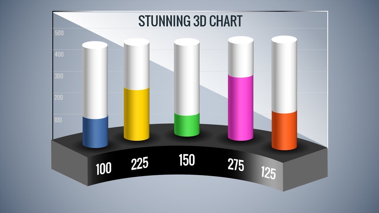
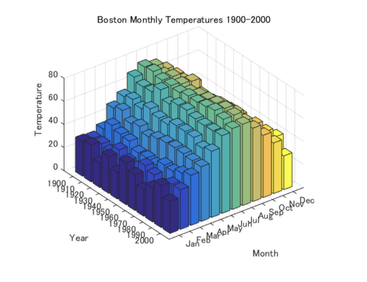
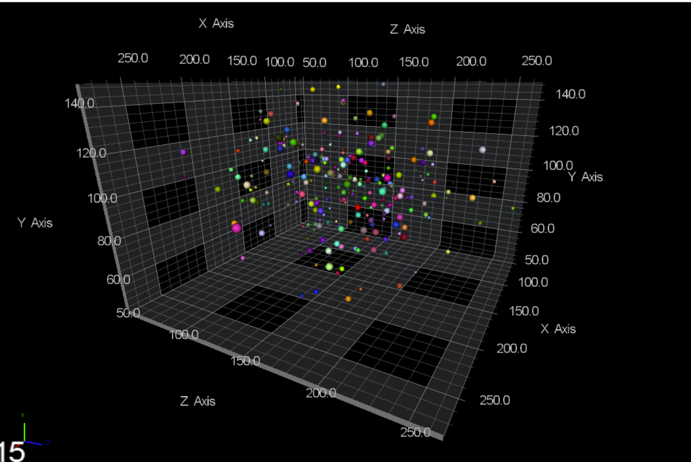
3D Graphs
Instead of 3D Graphs
- Find other channels: hue & size are good candidates. (bubble chart)
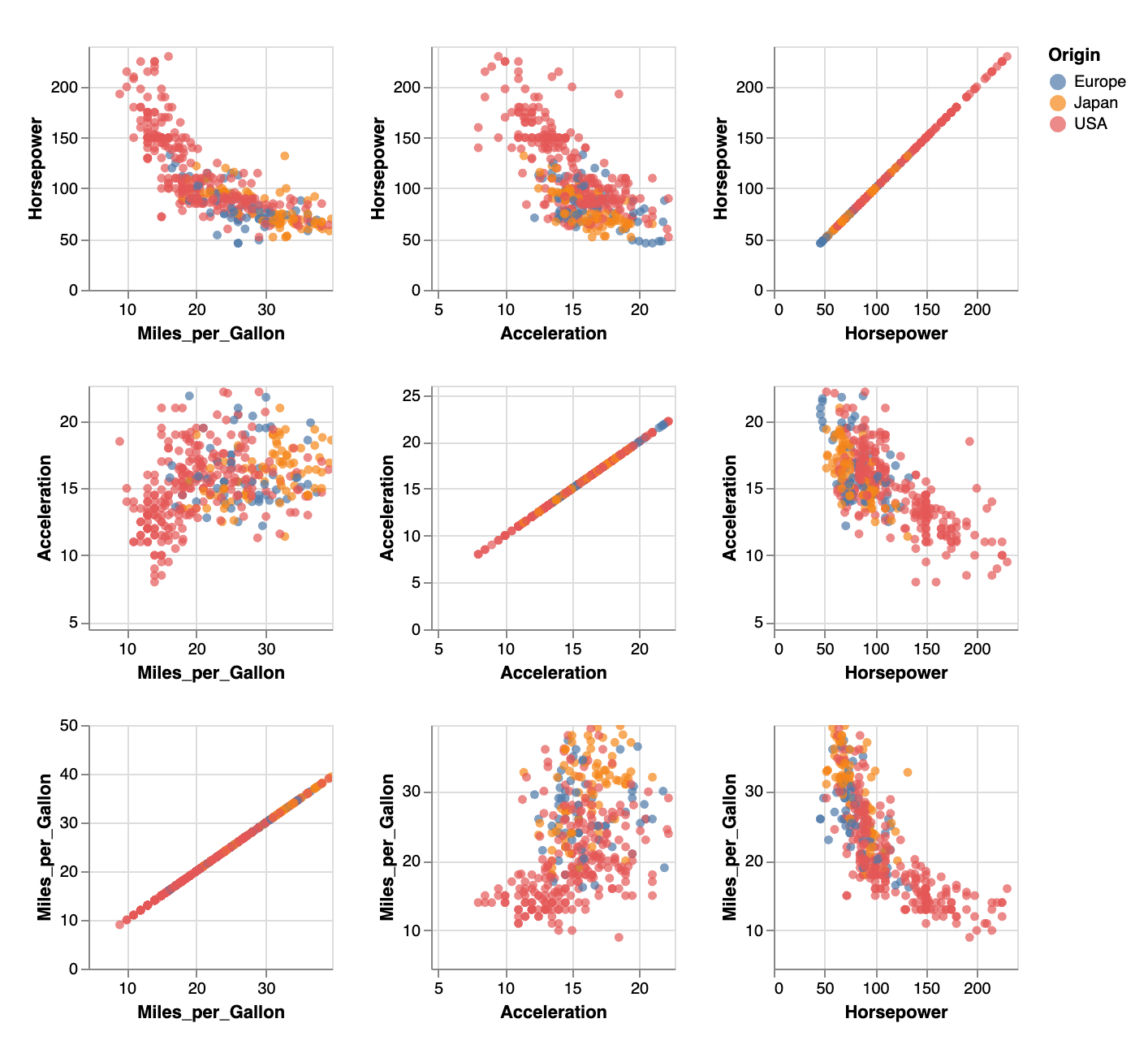
- Or make multiple 2D graphs with XY/YZ/XZ pairs.
What is Color?
Wavelengths of light are perceived as particular colors:

In practice: we almost never see monochromatic color, light sources emit a spectrum & we perceive peaks.
Color & the Eye
Rods
- "brightness"
- spread throughout retina
- more sensitive in low light conditions
Cones
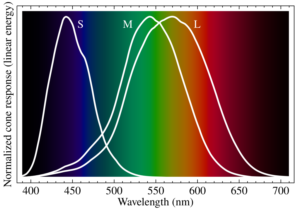
- 3 types with peak sensitivity at different frequencies
- concentrated in center of eye
- less sensitive in low light conditions
Spectrum vs. What We See
What we actually see is always a blend of multiple peaks.
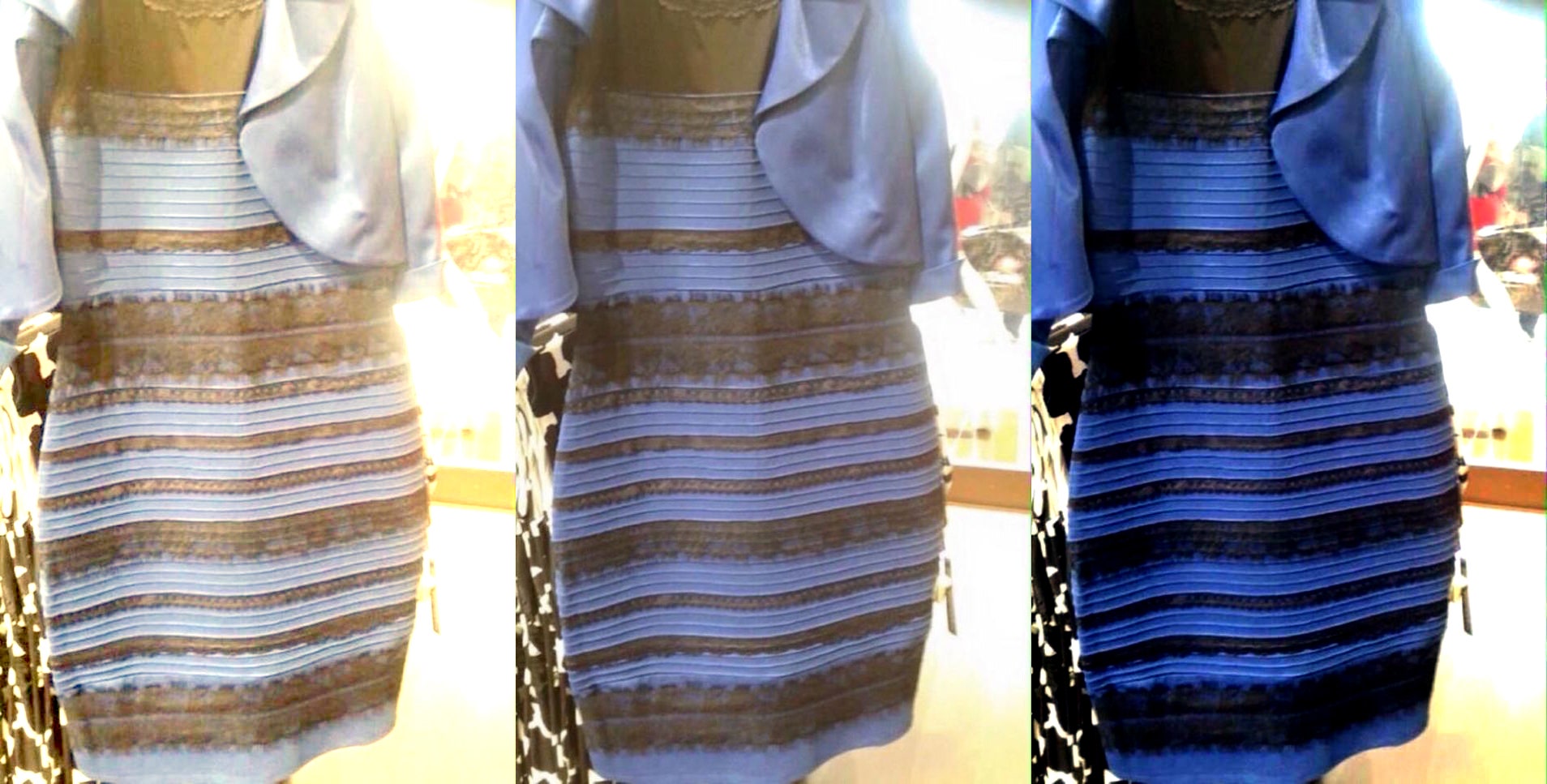
This is impacted by ambient light conditions, as well as quirks of our visual processing.
In actuality, multiple combinations of light can give same color (metamers).
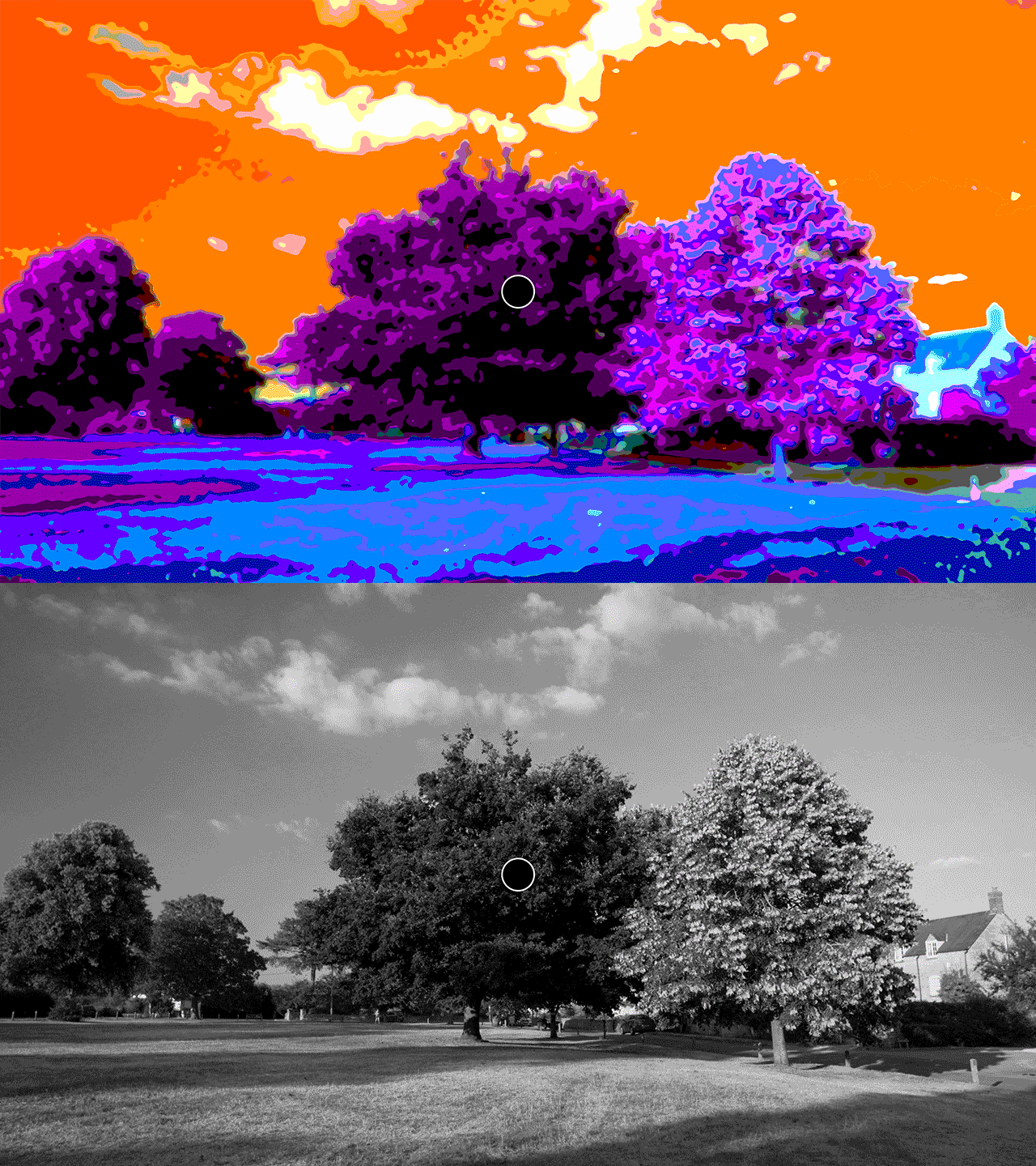
Chromatic Adaptation
Source: Andrew Steele https://www.youtube.com/channel/UC-XYsDNh4-886rMNLnnwR_w
Color Naming
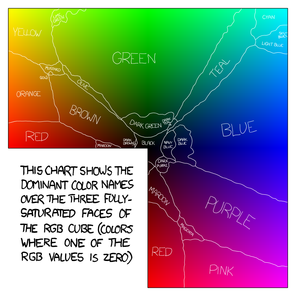
Color naming is highly subjective, and research has shown that the ability to name a color correlates highly with the ability to distinguish it.
Be particularly careful with blue/green boundaries, as there are significant cultural differences.
Source: https://blog.xkcd.com/2010/05/03/color-survey-results/
Cultural Considerations
- American audiences associated red & blue with political parties on any map in a political context.
- Also international meaning of red & blue is flipped: red is left, blue is right.
- Most other colors have contradictory meanings depending on culture. For example, yellow might be chosen to denote success (parts of Africa) or be associated with death (Middle East).
Color on a Page
Ink absorbs light, so we work with subtractive blending. Our base colors are cyan, magenta, and yellow. To save on ink costs, we throw in black/contrast as well.
We call this CMYK color.
Color on a Screen
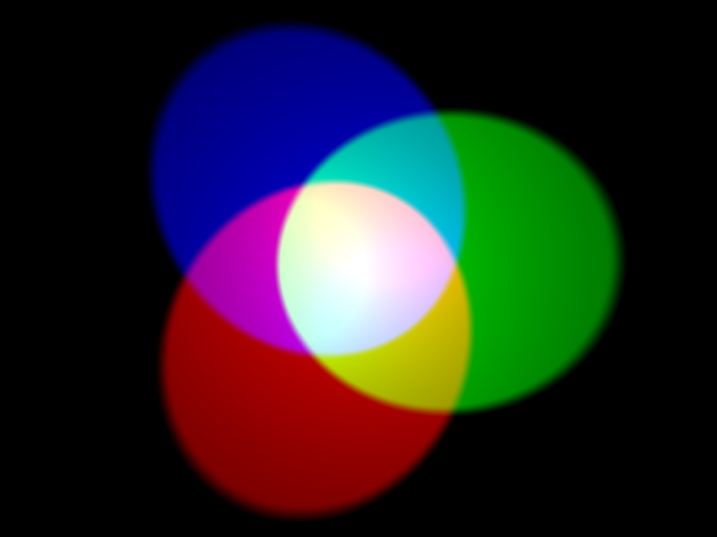
Screens emit light, which means we use additive blending of red, green, and blue light. Every pixel of a screen can emit these three colors in different intensities.
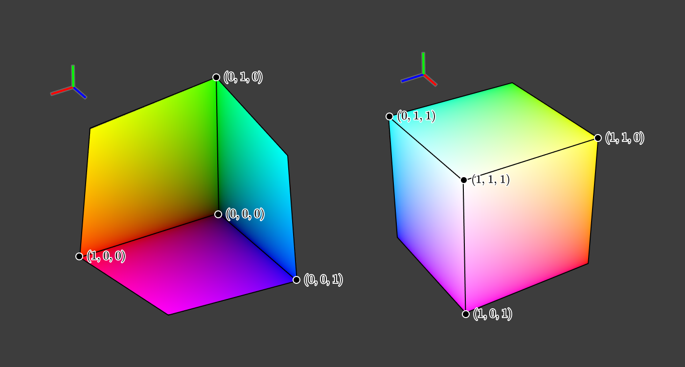
A common way to refer to colors is by their intensity in each of these three channels.
this is 0% red, 100% green, 0% blue intensity this is 20% red, 60% green, 20% blue intensity this is 100% red, 0% green, 100% blue intensity
RGB space as a cube
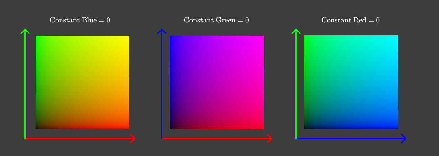
RGB as pair plots
Remember this trick for your own 3-dimensional data!
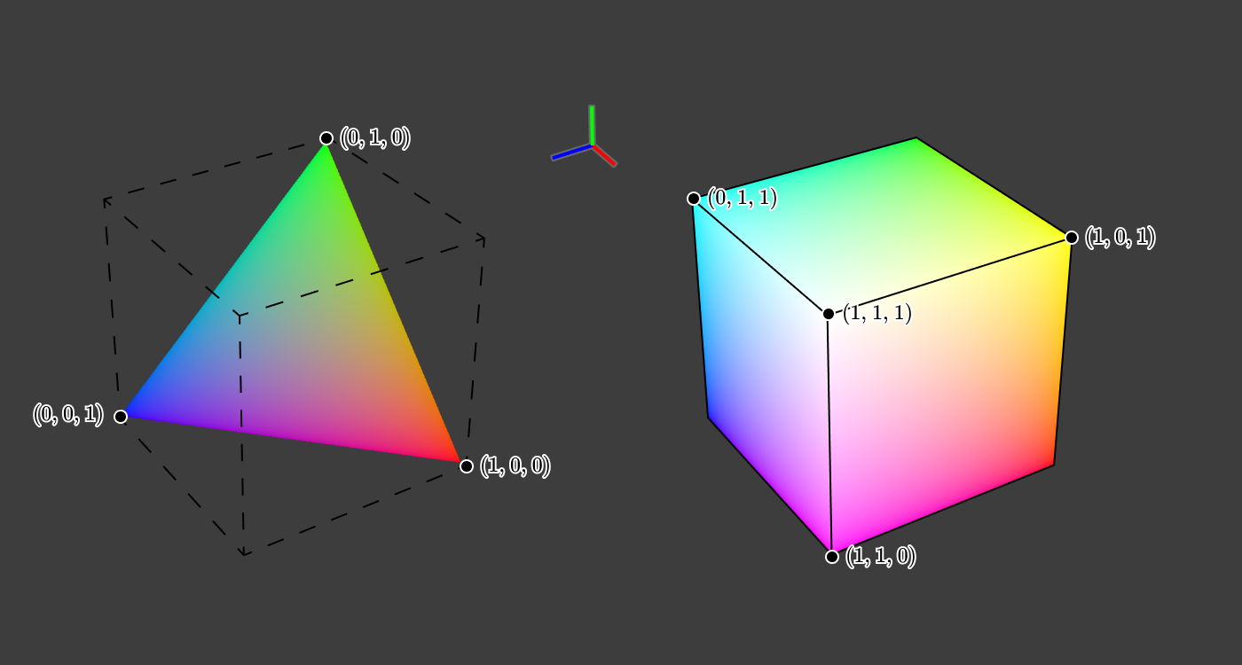
A slice through the middle of the cube gives colors of comparable brightness. (You may have seen such a triangle in color pickers.)
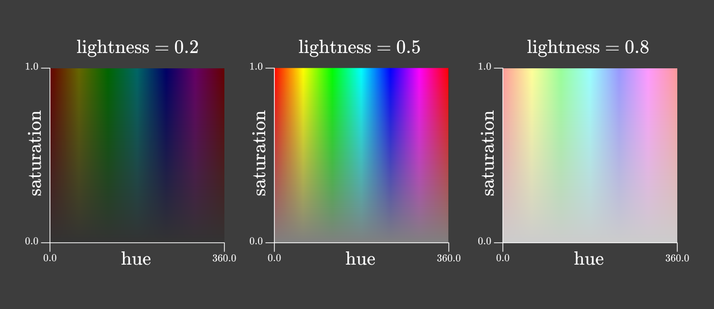
HSL
An alternative color space that's very useful for visualization is HSL color space.
Hue, Saturation, Luminosity
Aside: What about "alpha"?
You will often see a fourth channel: RGBA, HSLA.
This is known as alpha transparency (translucency).
This has to do with how the program in question blends the colors. The final pixel values on the screen will still be converted to RGB components.
- Use sparingly.
- Variations are very subtle, and background dependent.
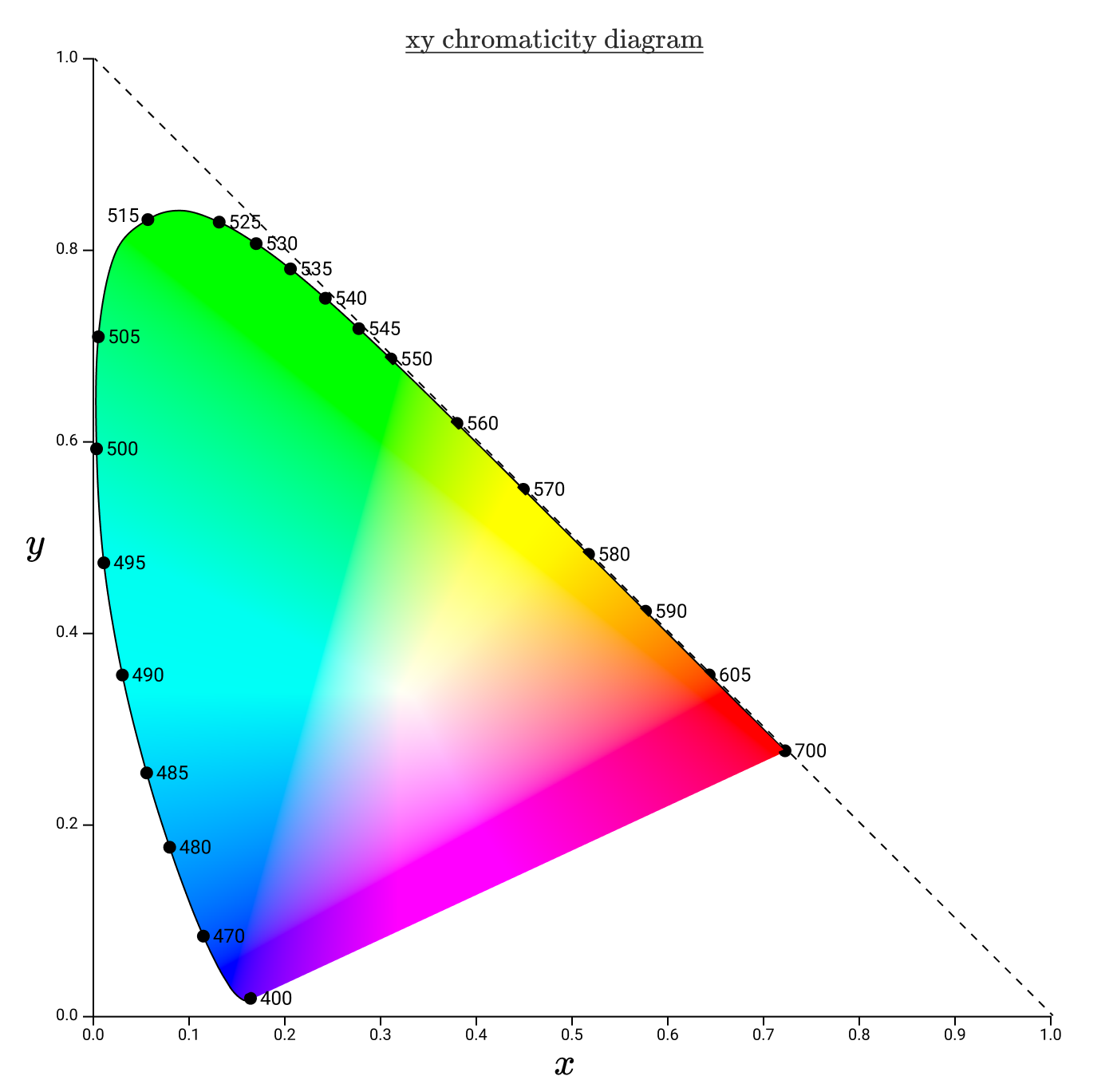
CIE XYZ
Derived in 1931(!) based on human perception.
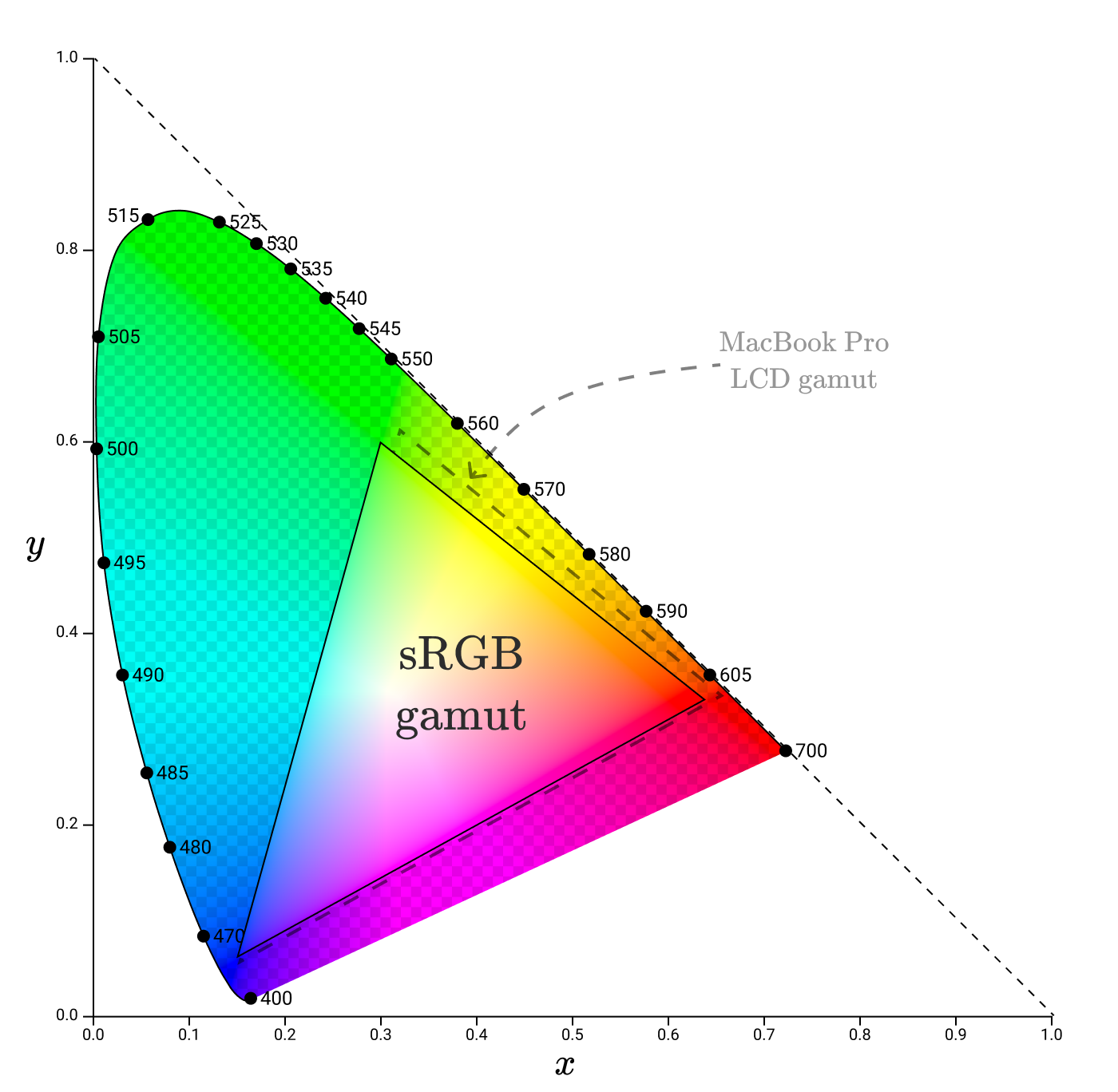
Screen Gamut
Screens can't show the entire range of visible colors accurately, they define a "gamut". Since ~1996 most devices aim at a standard gamut to ensure similar representations of color, but even high end devices are not perfectly aligned.
Projectors (like the one you're likely viewing this on) usually have skewed gamut.
Moral of the story: Consider your medium!
Other Variations
TODO: colorblindness, etc.
What does all this mean for visualization?
Color choices should be made with respect to:
- medium (screen vs. print, type of screen)
- audience (culture, vision differences, expectations)
- differentiability
Role of Color
- Identify - Different color per category/actor.
- opt for distinct hues
- Group - Group like entities using same/like colors.
- often with similar hues
- Layer - Overlay different information while keeping contrast.
- saturation differences very important to not overwhelm eye
- Highlight - Call out important/relevant information.
- brightness and hue differences important
Color Channels & Data Types
TODO: https://docs.google.com/presentation/d/1avOsobdcsTG6qaDVCSesIOBFcfxjH12d/edit#slide=id.p27 TODO: (also 33 and 34)
Types of Palettes
- qualitative
- sequential
- diverging
Hue Separation
- distinct
- grouped
Legibility
An important issue when using colored text and/or backgrounds is legibility.
TODO: font legibility image
"Get it right in black & white"
A common mantra among visual designers.
Ensure that you aren't using hue alone for your image.
TODO: image
Tools
- Vega Schemes: https://vega.github.io/vega/docs/schemes/
- Contrast/theme exploration: https://schubert-da.github.io/dataviz-palette-tool/
- Theme exploration for cartography: https://colorbrewer2.org/
- Color-theory based theme creator: https://meodai.github.io/poline/
- Theme creator w/ theme sharing: https://coolors.co
Color-Blindness
- MacOS/iOS app: https://michelf.ca/projects/sim-daltonism/
- Browser extensions (search "colorblindness" in your browser of choice)
Acknowledgements & References
Thanks to Alex Hale, Andrew McNutt, and Jessica Hullman for sharing their materials.
Color space images are from https://jamie-wong.com/post/color/, which is an incredible resource if you'd like to go deeper into both the biology and math of color.
