# Visualizing Uncertainty
## CAPP 30239
---
---
---
## What causes uncertainty?
1) **measurement error** - An instrument used has some non-perfect degree of accuracy. In a survey, this could be a poorly-worded question.
2) **model uncertainty** - Models make assumptions and simplifications, different assumptions lead to different outcomes.
3) **sampling variability** - Differences between sample & population.
4) **missing data** - How missing data is accounted for & represented.
The result is that we have a range or distribution, where we want a number to use with one of our channels (Hue, X, Y, etc.).
---
## Challenges of Uncertainty
Often left out, in part due to being hard to understand, and even harder to visualize.
Omission however misleads audiences, especially where a lot of significant figures are included.
*Global Population Uncertainty: ±160 million people (2%)*
---
## Challenges of Uncertainty
Uncertainty estimates are simplified, often out of necessity.
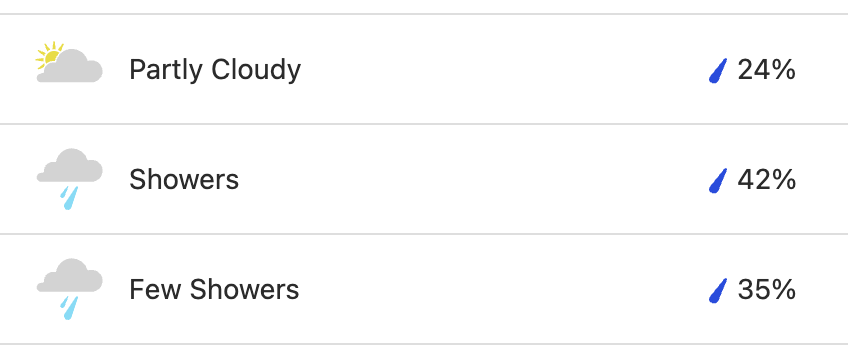
30% chance of rain: "A 30% chance that at least 0.01" of rain will fall somewhere within a given area over a 12 hour period."
**Do I bring an umbrella?**
---
## Challenges of Uncertainty
Complexity of visualization can overwhelm audience, obscure other meaning.
From a data-ink ratio perspective, it is understandable why if the error bars do not seem relevant to a narrative, that they would be omitted.
---
## Including Uncertainty
If omitting uncertainty misleads, it violates our prime directive of **graphical integrity**.
The job then, is to find ways that are **audience appropriate** & **don't obfuscate the meaning**.
The difficulty will be in resolving this tension.
---
## Common Techniques
- Uncertainty as Probability
- Error Bars
- Confidence Bands
---
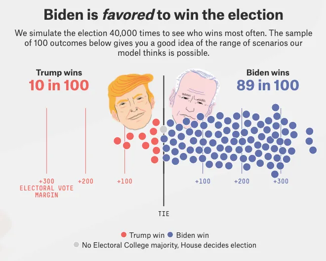
## Uncertainty As Probability
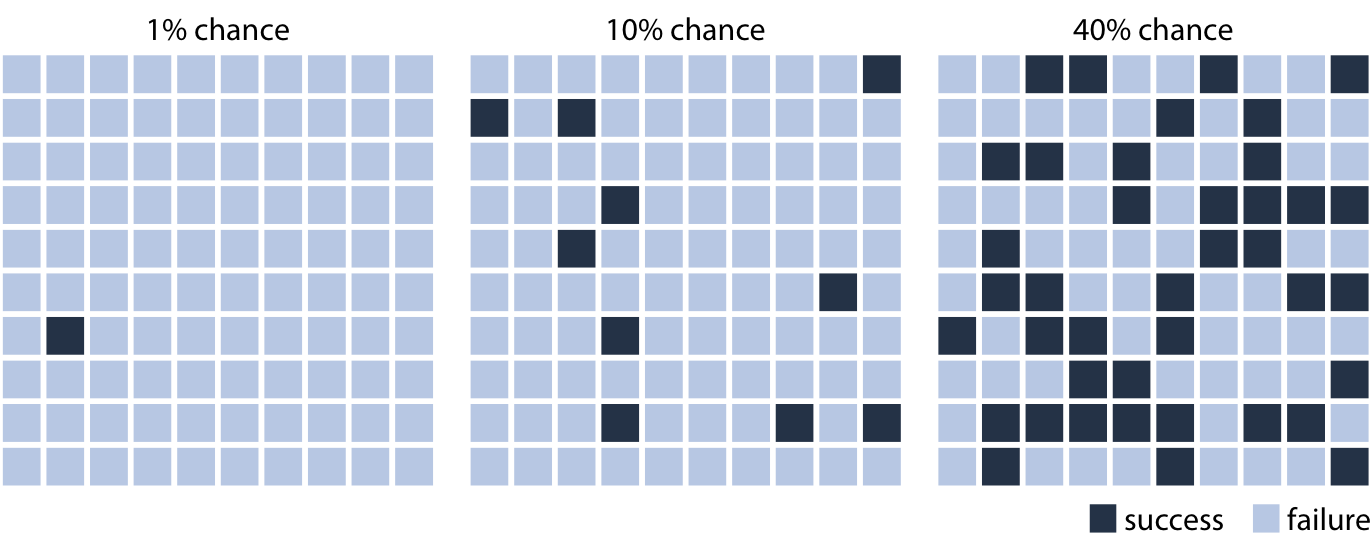
Random waffle chart: works for cases with discrete outcomes.
---
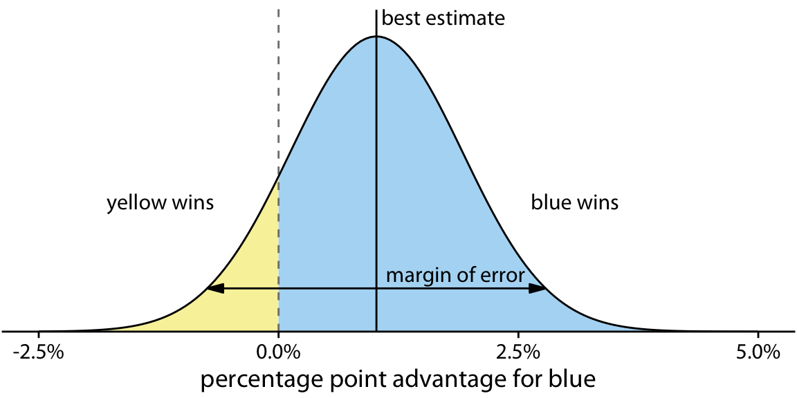
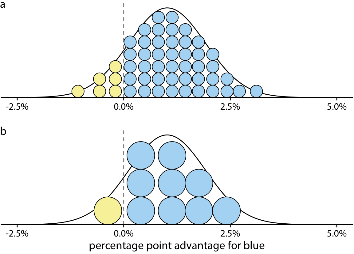
## Uncertainty As Probability
In practice, we often care about more than boolean outcome.
---
---
---
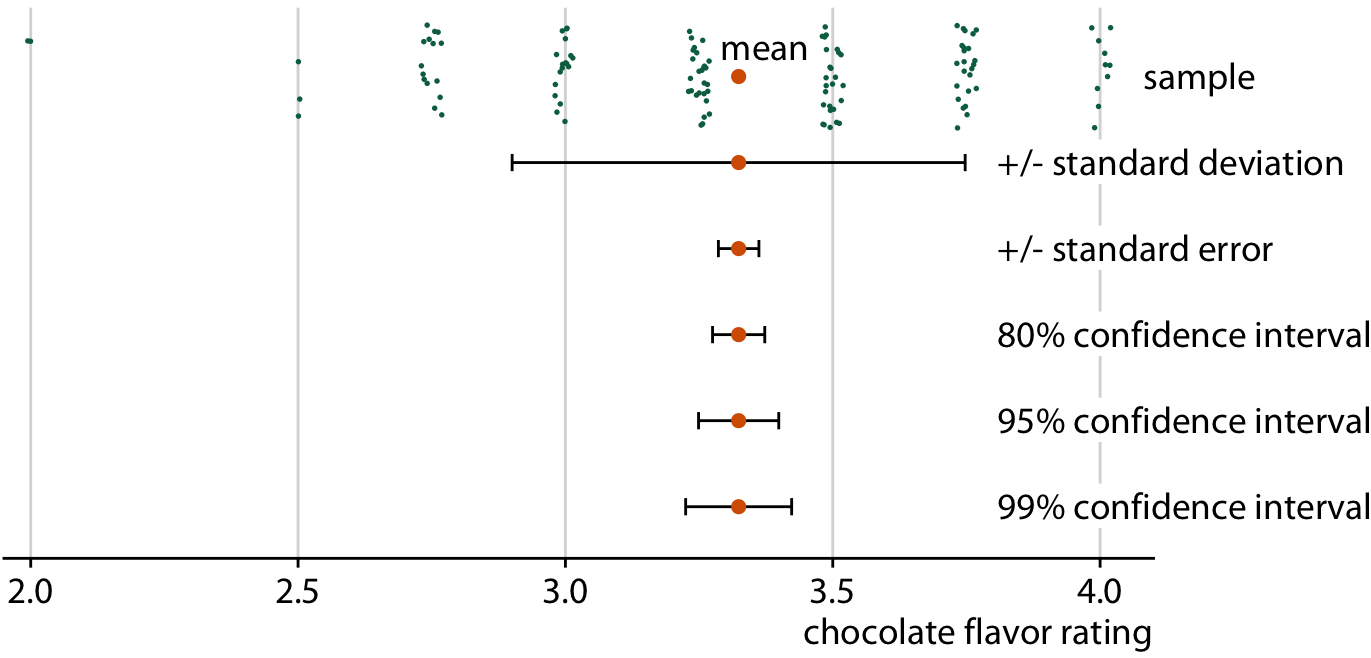
## Uncertainty of Point Estimates
These work when we're focused on uncertainty around a particular outcome.
Sometimes we need to show uncertainty around discrete measurements, or projections.
---
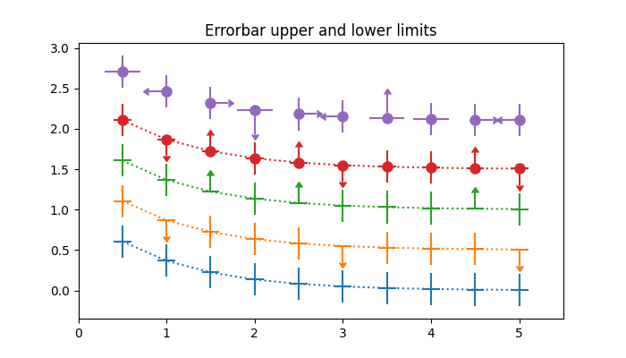
### Error Bars
---
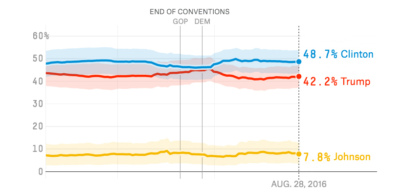
### Error Bands
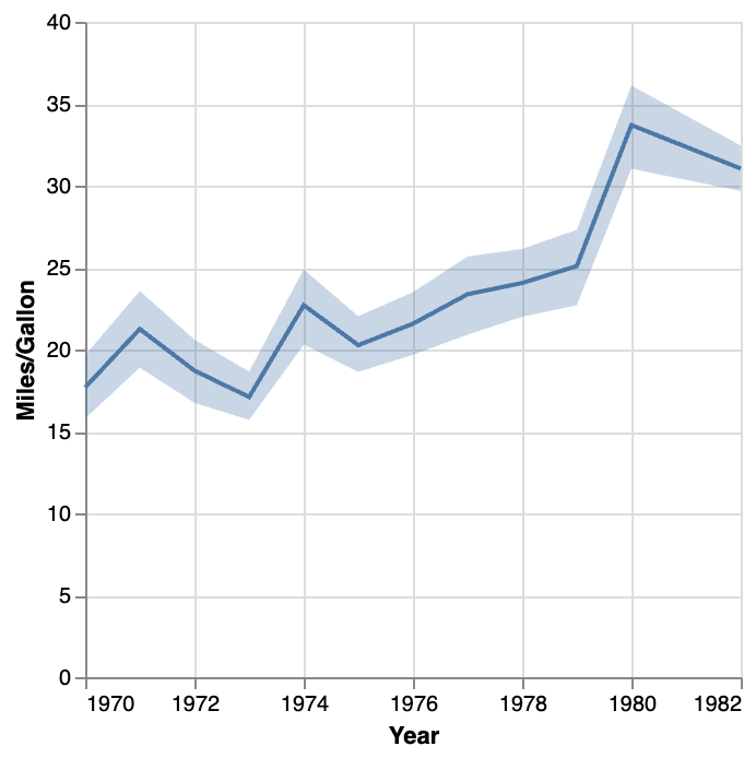
```python
line = alt.Chart(source).mark_line().encode(
x='Year',
y='mean(Miles_per_Gallon)'
)
band = alt.Chart(source).mark_errorband(extent='ci').encode(
x='Year',
y=alt.Y('Miles_per_Gallon').title('Miles/Gallon'),
)
band + line
```
---
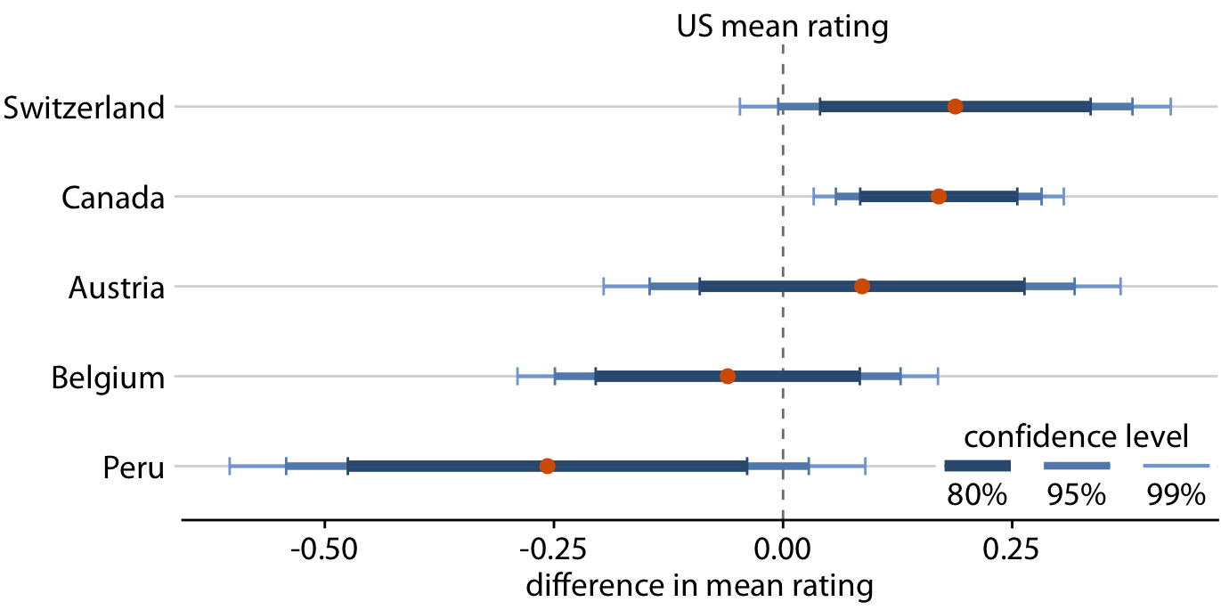
### Issues with Error Bars & Confidence Bands
1) There is no pre-defined meaning of these intervals.
**If error bars or bands are included, the legend must include information on the meaning.**
2) Error bars are common in scientific & academic literature, other audiences cannot be assumed to understand them.
3) Restricted to 1D/2D dots. If variable being expressed is mapped to color, area, etc. then alternative presentations needed.
---
---
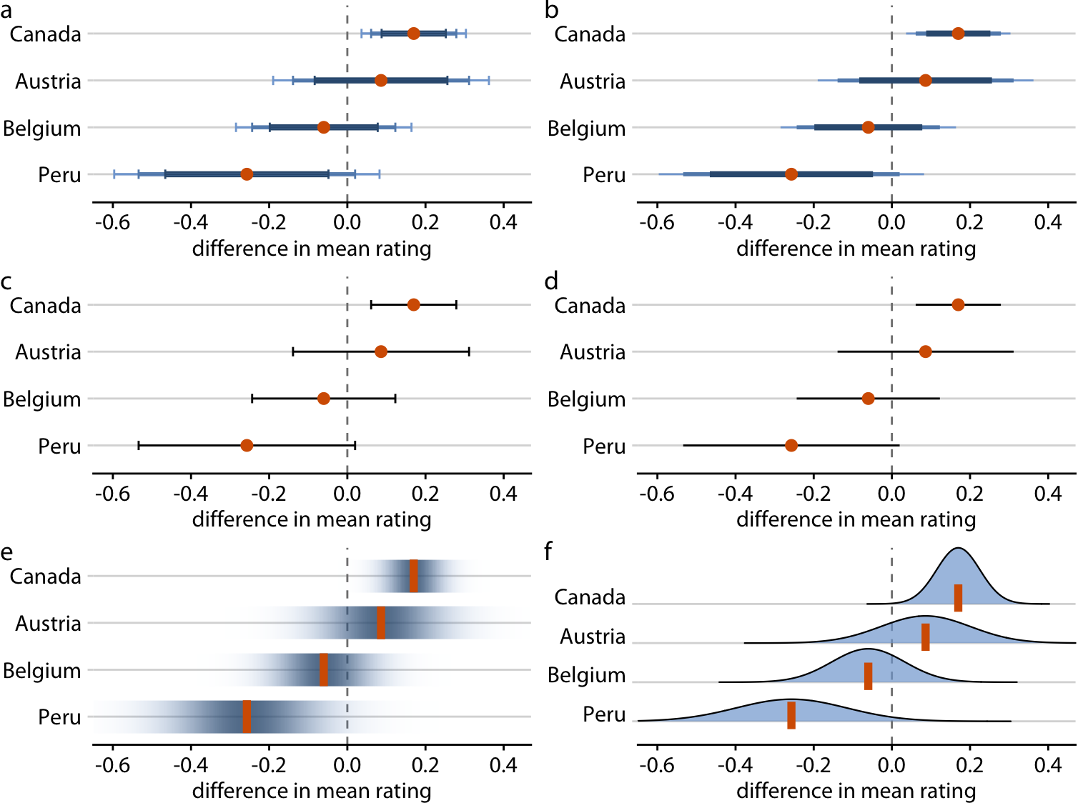
### Variations on Error Bars & Intervals
---
---
---
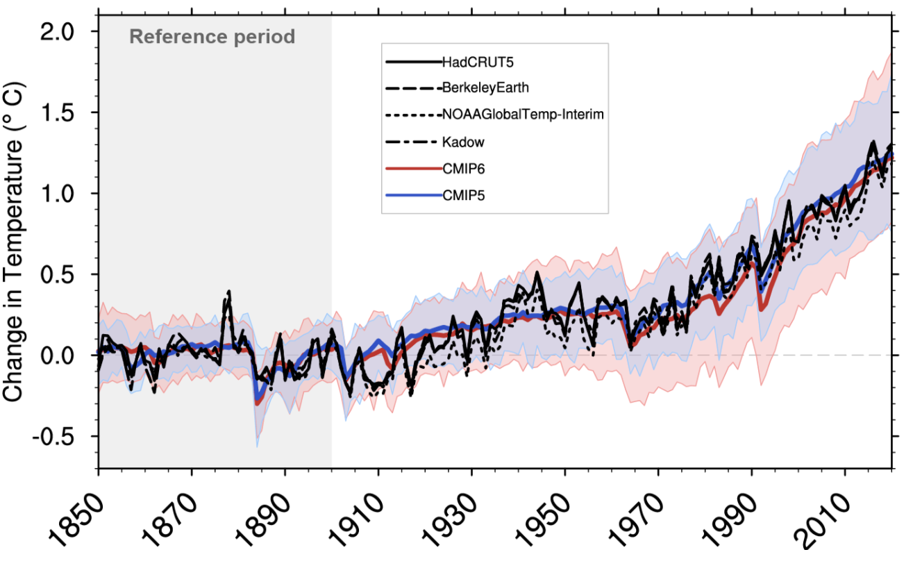
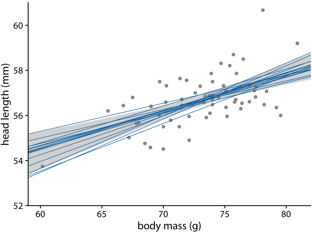
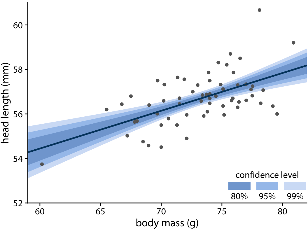
### Regression Uncertainty
---
### Regression Uncertainty
---
## Other Approaches
---
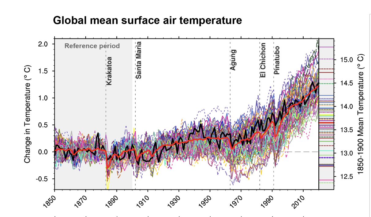
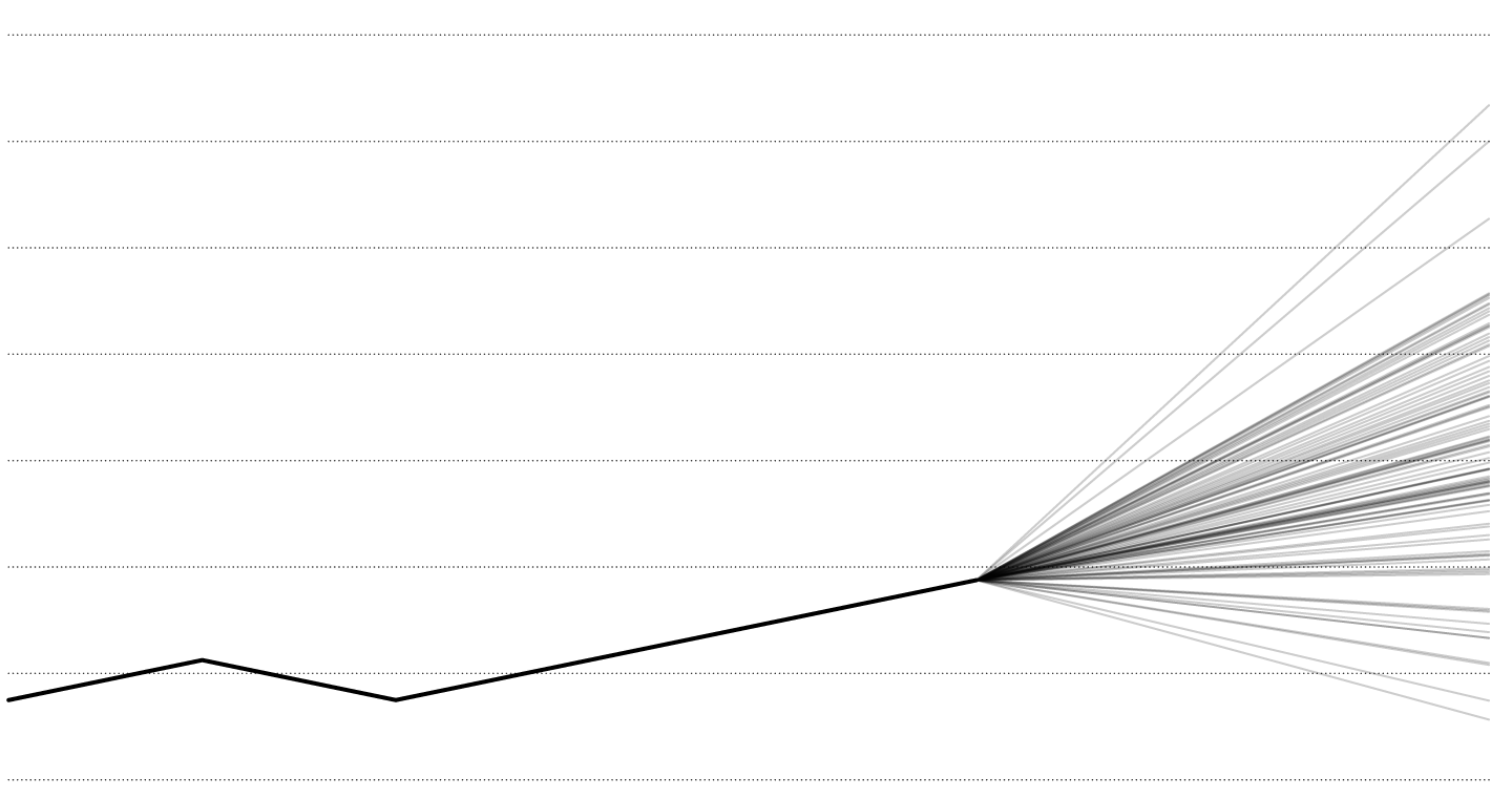
### Showing Multiple Futures
---

---
### Hurricane Uncertainty