--- theme: custom-theme --- # Perception & Color ## CAPP 30239 ![bg right](rainbow.jpg) --- ## Today - What matters most when creating a visualization? - How does human **perception** factor into visualization design? - Understanding **color**, and computational representations of it. --- ## What is the most important question when creating a visualization? --- ## What is the most important question when creating a visualization? --- ## Audience First - Who are you presenting to? - How familiar are they with the data? - What is their numerical & visualization literacy? - Via what medium will they receive the information? - What are you trying to do? (Persuade, Inform, Inspire?) *Only now can we start thinking about data and presentation.* --- ## Perception - **Selective** - We can only pay attention to so much. - **Patterns** - Our brains are pattern-matching machines, audience will benefit from intentional patterns & be distracted by unintentional ones. - **Limited working memory** - We hold a very limited set of information in our minds at once. --- ## What do you see?
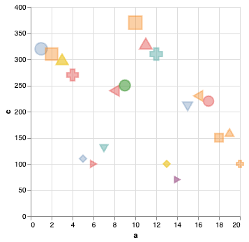
![](viz-1.png)
```python alt.Chart(random_df).mark_point().encode( alt.X("a"), alt.Y("c"), alt.Color("b"), alt.Size("c"), alt.Shape("a:N"), alt.Fill("b"), alt.Opacity("b"), ) ```
--- ## What do you see?
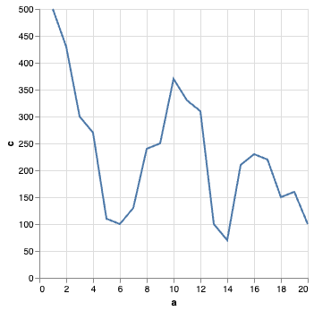
![](viz-2.png) ``` alt.Chart(random_df).mark_line().encode( x="a", y="c", )` ```
--- ## Effectiveness Revisited ![width:800px](effectiveness.png) ---
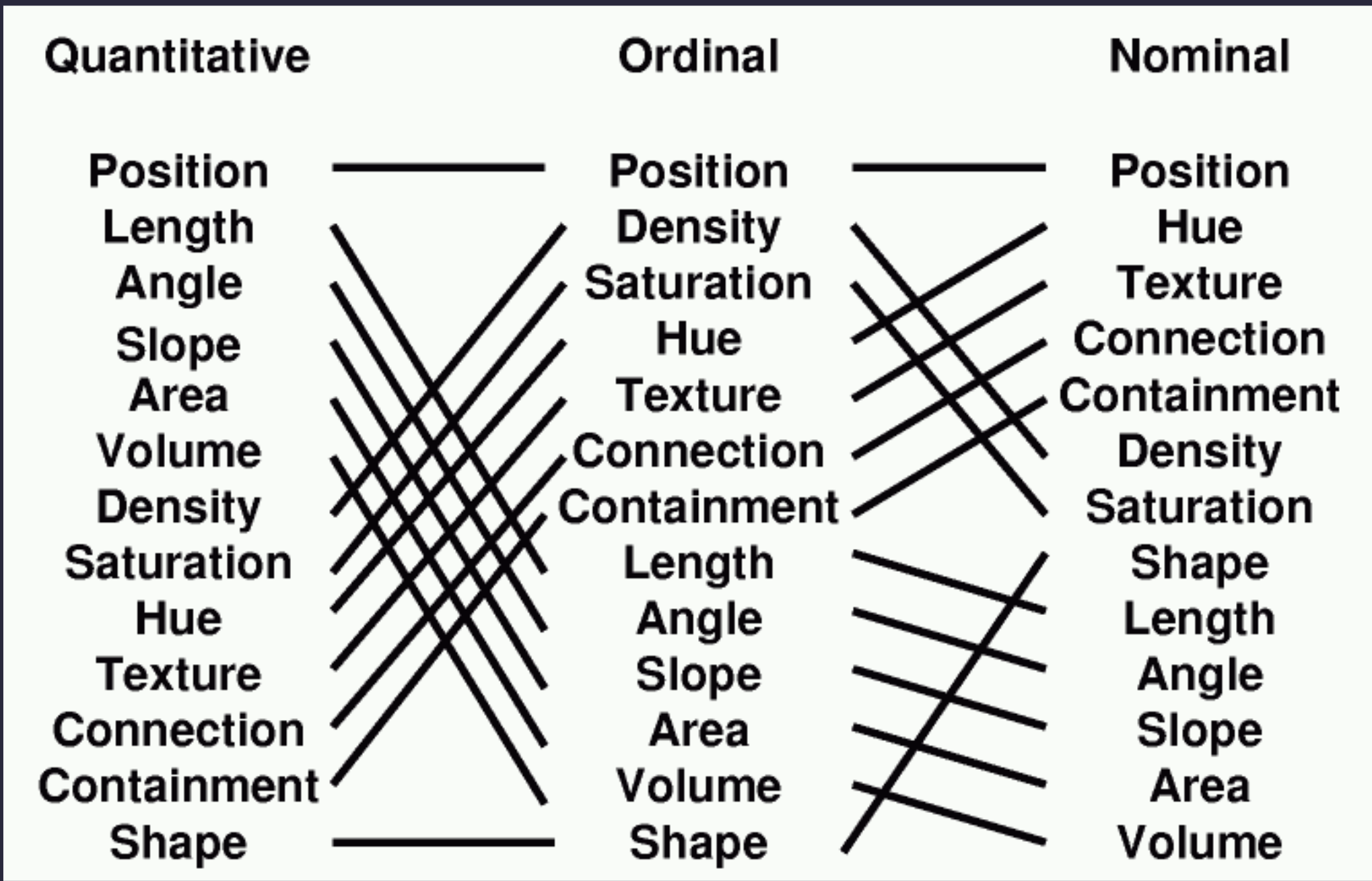
**Altair Channels** - Position (`X, Y`) - Angle (`Angle`) - Area (`Radius`, `Size`) - Hue, Saturation (`Color`) - Texture (`Opacity`, `Fill`) - Shape (mark type, `Shape`)
**What about?** - Length - Slope - Volume - Density - Connection - Containment
--- **Derived Properties** - Length/Area - size of bars (`X`, `Y`) - Slope & Density - affected by scale - Connection - ex. layering of lines w/ points - Containment - achieved with layering What about *volume*? --- ## Stevens' Power Law Stevens (1975): Human response to sensory stimulus is characterized by a power law with different exponents with different stimuli. perception = (magnitude of sensation)a Smaller a exponent: harder to perceive changes. Stevens measured values of a by exposing people to varied stimulus and asking them to compare magnitudes. ---
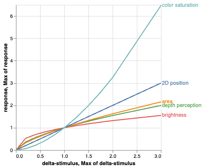
![](stevens.png)
| Continuum | Exponent | |-|-| | Color **Brightness**| 0.33-0.5 | | Smell| 0.6 | | Loudness | 0.67 | | **Depth Perception** | 0.67 | | Area | 0.7 | | 2D Planar Position | 1.0 | | Warmth | 1.3-1.6 | | Color **Saturation** | 1.7 | | Electric Shock | 3.5 |
--- ## 3D Graphs ![](stunning-3d-chart.jpg) --- ![](datavizproject.png) --- ![](3d-scatter.png) --- ## Instead of 3D Graphs - Find other channels: hue & size are good candidates. (bubble chart) - Or make multiple 2D graphs with XY/YZ/XZ pairs. ![bg left](scatter-matrix.png) --- ## What is Color? Wavelengths of light are perceived as particular colors: ![](linear_visible_spectrum.svg.png) What's missing? --- ## Color & the Eye ### Rods - spread throughout retina - more sensitive in low light conditions - brightness ("lightness") ### Cones - 3 types with peak sensitivity at different frequencies - concentrated in center of eye - less sensitive in low light conditions - hue & saturation ![bg right](cone-fundamentals.png) --- ## Spectrum vs. What We See What we actually see is always a blend of multiple peaks. This is impacted by ambient light conditions, as well as quirks of our visual processing. ![height:400px](the-dress.jpg) In actuality, multiple combinations of light can give same color (**metamers**). --- ## Chromatic Adaptation ![](demo-bw-illusion-andrew-steele.gif) Source: Andrew Steele --- ## Color Naming Color naming is highly subjective, and research has shown that the ability to name a color correlates highly with the ability to distinguish it. ![bg right](xkcd-color-map.png) Be particularly careful with blue/green boundaries, as there are significant cultural differences. Source: https://blog.xkcd.com/2010/05/03/color-survey-results/ --- ## Cultural Considerations ![bg right width:600px](hok-uk.svg) - American audiences associated red & blue with political parties on any map in a political context. - Also international meaning of red & blue is flipped: red is left, blue is right. - Most other colors have contradictory meanings depending on culture. For example, yellow might be chosen to denote success (parts of Africa) or be associated with death (Middle East). --- ## Color Vision Deficiency More accurate name for what is commonly known as colorblindness. - Red-Green CVD - most common - four types: Dueteranomaly and Protanomaly (mild) to Protanopia and Dueteranopia (complete) - Tritanomaly/Tritanopia: blue/green and yellow/red confusion. - rarest, complete lack of color vision, usually corresponds to other vision issues as well ![bg right width:600px](colorblind.jpg) --- ## Color on a Page ![bg right](cmyk.svg) Ink absorbs light, so we work with subtractive blending. Our base colors are cyan, magenta, and yellow. To save on ink costs, we throw in black/contrast as well. We call this CMYK color. --- ## Color on a Screen Screens emit light, which means we use **additive blending** of red, green, and blue light. Every pixel of a screen can emit these three colors in different intensities. ![bg right](additive.png) --- ## Color Spaces Ways of describing a color mathematically, usually have 3 components to match our perception of color: - RGB (early photography) - CIE XYZ (1931) - HSB/HSV/HSL (1970s) ![bg right width:700px](rgb-khan.jpg) --- A common way to refer to colors is by their intensity in each of these three channels. this is 0% red, 100% green, 0% blue intensity (#00ff00) this is 20% red, 60% green, 20% blue intensity: (#143c14) this is 100% red, 0% green, 100% blue intensity: #ff00ff This is sometimes expressed in hexadecimal: ![height:120px](hexrgb.png) ![bg right](rgb-pixels.jpg) --- ### RGB space as a cube ![cube](LinearRGBCube.png) --- ### RGB as pair plots ![pair plots](RGBPairPlots.png) Remember this trick for your own 3-dimensional data! --- ![height:500px](TriangleSliceRGB.png) A slice through the middle of the cube gives colors of comparable brightness. (You may have seen such a triangle in color pickers.) --- ## HSL ![height:500px](HSL.png) An alternative color space that's very useful for visualization is HSL color space. Hue, Saturation, Lightness | --- ## Aside: What about "alpha"? You will often see a fourth channel: RGB**A**, HSL**A**. This is known as alpha transparency (translucency). This has to do with how the program in question *blends* the colors. The final pixel values on the screen will still be converted to RGB components. - Use sparingly. - Variations are very subtle, and background dependent. --- ## CIE (RGB / XYZ / CIELAB) Based on human perception experiments where people would adjust dials to recreate colors out of red, green, and blue light. First from 1920s, revised in 1970s. *Commission internationale de l'éclairage* (Illumination) ![bg right](cie-xyz.png) --- ## Screen Gamut Screens can't show the entire range of visible colors accurately, they define a "gamut". Since ~1996 most devices aim at a standard gamut to ensure similar representations of color, but even high end devices are not perfectly aligned. ![bg right](gamut2.png) Projectors (like the one you're likely viewing this on) usually have skewed gamut. Moral of the story: **Consider your medium!** --- ## What does all this mean for visualization? Color choices should be made with respect to: - medium (screen vs. print, type of screen) - audience (culture, vision differences, expectations) - differentiability Using HSL to build a palette allows you to choose uniform brightness/saturation and pick hues as close together/far apart as needed. --- ## Role of Color - **Identify** - Different color per category/actor. - opt for distinct hues - **Group** - Group like entities using same/like colors. - often with similar hues - **Layer** - Overlay different information while keeping contrast. - saturation differences very important to not overwhelm eye - **Highlight** - Call out important/relevant information. - brightness and hue differences important --- ## Color Channels & Data Types ### Lightness is perceived as ordered Good for **Ordinal** variables ![height:50px](ordinal.png) **Quantitative** (Continuous) variables harder to discern ![height:50px](qual.png) ### Hue typically unordered **Nominal** variables. ![height:50px](nominal.png) --- ### Types of Palettes - Qualitative - Nominal data - Sequential - Quantitative data - Diverging - Data with a meaningful zero-point (increase/decrease, more/less) ![](palette-types.jpg) --- ### Hue Separation Pick distinct hues for unrelated variables. Grouped schemes can be used where there are relationships among the categories. ![bg left width:600px](vega-schemes.png) --- ## Color Tips - Aim for no more than ~6 colors that need to be distinguished. - Colors should be distinct & differentiable by name. - Be mindful of cultural considerations & symbolism. - Ensure color schemes chosen appropriately for types of data. - "Get it right in black & white" --- ## "Get it right in black & white" A common mantra among visual designers. Ensure that your hues have different brightness levels. Ensure that you aren't using hue alone for your image. ![bg left width:600px](vega-schemes-bw.jpg) --- ## Text Legibility An important issue when using colored text and/or backgrounds is **legibility**. Web Content Accessibility Guidelines require a 4.5 color contrast (3:1 for large text). Minimize *saturation* in backgrounds, pick a font color with opposing *lightness*. ![bg left width:600px](contrast.png) --- ## Tools - Vega Schemes: https://vega.github.io/vega/docs/schemes/ - Contrast/theme exploration: https://schubert-da.github.io/dataviz-palette-tool/ - Theme exploration for cartography: - Color-theory based theme creator: https://meodai.github.io/poline/ - Theme creator w/ theme sharing: https://coolors.co - HSL/RGB picker: - Contast checker: ### Color-Blindness - MacOS/iOS app: https://michelf.ca/projects/sim-daltonism/ - Browser extensions (search "colorblindness" in your browser of choice) --- ## Acknowledgements & References Thanks to Alex Hale, Andrew McNutt, and Jessica Hullman for sharing their materials. Color space images are from , which is an incredible resource if you'd like to go deeper into both the biology and math of color. - https://www.math.csi.cuny.edu/~mvj/GC-DataViz-S23/lectures/L6.html - https://en.wikipedia.org/wiki/Stevens%27s_power_law - https://colorusage.arc.nasa.gov - https://vega.github.io/vega/docs/schemes/